Operable: Provide options for navigation
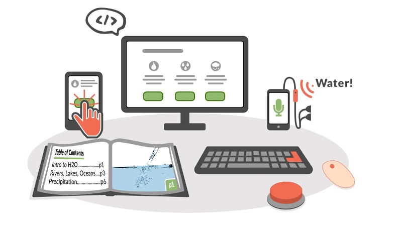
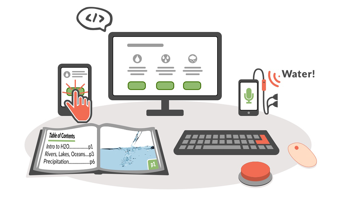
Illustration of a series of media representing various ways of interacting with the same content on a range of tools, including a text book, a tablet, desktop computer, and smart phone.
With operable content you will provide your learners options for how they can navigate and interact with the content: with a mouse, a keyboard or even voice commands. For example, your learners with visual impairments may not be able to use a mouse to select options on the screen, but they can use keyboard shortcuts or touch gestures to navigate the content by heading or link. Others, such as programmers and power users, may just prefer the keyboard because they are able to navigate faster with it.
To make your content operable:
- Provide a clear structure with headings.
- Create descriptive links.
- Check for keyboard accessibility.
- Provide sufficient time.
- Avoid content that flashes.
Build a table of contents with headings
Organize your content into sections that start with descriptive headings to help with understanding and improve navigation for everyone. Break up a long document with section headings to make it easier to scan and more inviting to readers. In many authoring tools, you can automatically create a table of contents from the section headings. By selecting a link in this table of contents your learners can quickly skip to any section in the document. This will save them valuable time on longer documents.
The way the headings are indented in the table of contents can also reveal how the information is organized to your learners. Generally, a web page or document should have a single first level heading to indicate the title or the main idea. This first level heading is then typically followed by several second level headings to indicate the major sections, with third level headings nested inside these to indicate subsections. The order is important. You should not skip heading levels (such as by placing a fourth level heading between two second level headings). When the headings are nested correctly, the table of contents should provide a meaningful outline of the content for the reader.
Navigation by heading is especially helpful for screen reader users. On most screen readers you can use a keyboard shortcut or touch gesture to call up a list of the headings on the web page or document. By selecting a heading from the list, you can skip ahead to a specific section and start reading from that point. For headings to work this way, make sure you assign the proper styles (such as heading level 1 or h1) to them. It is not enough for you to just select the heading text and use formatting options to make the text bigger and bold.
Make your links descriptive
On most screen readers, you can use a keyboard shortcut or touch gesture to bring up a list of the links. It will be difficult for you to determine the desired option if every item on the list reads as “click here” or “learn more.” For clarity, each link should be unique and able to stand on its own. The link text should be descriptive and indicate what will happen when you select the link.
Whenever possible, you should "mask" the web address or URL behind more descriptive text. With long web addresses, the screen reader may start to read the individual characters once it gets through the more human-readable part of the web address, and this can be confusing.
Check for keyboard accessibility
Much of the work of ensuring keyboard accessibility involves coding that is beyond the scope of this quick start. At a minimum, you should know how to test any widgets or online forms for keyboard accessibility to ensure when you add them to your content you are not creating barriers for learners.
The test for keyboard accessibility begins with a simple keyboard shortcut: press Tab to navigate the interactive elements (form fields or hyperlinks) in the web page or document. Press Shift and Tab to navigate in the opposite direction. As you navigate using the keyboard, it should be clear which element has focus (as indicated by a border or other styling). You should make sure that the focus moves around the content in a logical manner. If keyboard accessibility is not supported, you should consider a different resource that provides equivalent access.
Note: On the Mac, you will need to change your Safari preferences to activate Tab key navigation for all interactive elements.
Provide sufficient time
Your learners who rely on assistive technology may take longer to complete the same interactions as other learners. If timed performance is not essential to the goal of an activity, consider disabling the time limit or at least provide the option for learners to get more time as needed. Extra time may already be an accommodation for your learners when they take tests and quizzes. A variety of learning management systems support extra time for these kinds of assessments.
Synchronous chat can be especially challenging for some learners. Those with learning or cognitive disabilities may have a difficult time keeping up with the multiple conversations taking place at once between chat participants . Users of assistive technology may also not be able to keep up with the fast pace and flow of the conversation due to limitations in either their technology or the accessibility of the chat interface.
You should alert learners as early as possible that an online course requires synchronous chats. Learners can then make an informed decision based on their previous experience with synchronous chat and bring up any concerns they have to the attention of the instructor. You could also do a trial run of the chat system with the learner to determine how well the interface works with assistive technology. Based on the findings from the trial, you can do further research into the accessibility of the chat system or consider alternatives. One is to provide a recording of the session along with a transcript of the text chat learners can review later.
Avoid content that flashes
For all learners, flashing or moving content can distract from the rest of the content. For some, it can actually trigger a seizure that requires some time off before they can return to the content. For these reasons, you should avoid animations and other content with rapidly flashing or moving content. Anything that flashes more than three times per minute can lead to the onset of a seizure.
Build your skills
Improve navigation and understanding with headings:
- Mark Up Headings in Microsoft Word (NC State)
- Mark Up Headings in Pages (Luis Perez)
- Mark Up Headings in Google Docs (Luis Perez)
Improve the usability of your links:
- Create Descriptive Links in Microsoft Word (NC State)
- Create Descriptive Links in Pages (Luis Perez)
- Create Descriptive Links in Google Docs (Luis Perez)
Provide sufficient time for interaction:
- Provide extra time for quizzes in Canvas (Canvas)
- Provide extra time for exams in Blackboard 9.1 (University of Arkansas, Little Rock)
- Provide extended time in the Quiz Tool for Desire to Learn (DePaul University)
Get to know the guidelines
The techniques on this page are also summarized in a table with the corresponding Web Content Accessibility Guidelines for your reference.
| Technique | Benefits Learners Who Are | Relevant WCAG Guidelines |
|---|---|---|
| Build a table of contents with headings | Blind, have learning disabilities | 2.4.1 Bypass Blocks (A); 2.4.6 Headings and Labels(AA) |
| Make your links descriptive | Blind | 2.4.4 Link Purpose (In Context) (A) |
| Check for keyboard accessibility | Blind; have motor or cognitive challenges; prefer to use the keyboard to speed up navigation | 2.1.1 Keyboard; 2.1.2 No Keyboard Trap |
| Provide sufficient time | Have motor difficulties that slow responses; require extra processing time due to cognitive disabilities | 2.2.1 Timing Adjustable (A) |
| Avoid content that flashes | Prone to seizures; easily distracted | 2.3.1 Three Flashes or Below Threshold (A) |