Perceivable: Present information in multiple ways
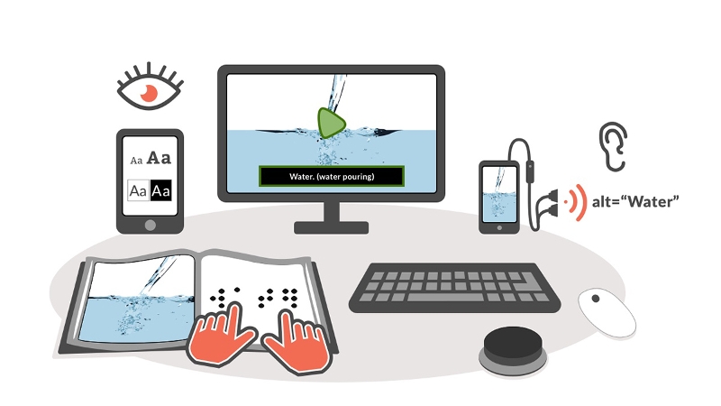

Illustration of a series of media representing varied ways of feeling, seeing and hearing content, including reading a braille book, adjusting type size and contrast setting on a tablet, viewing captions on a video, listening to alt text of an image on a smart phone.
With perceivable content, you provide options for learners to adjust the presentation of information to suit their individual needs and preferences. For example, a learner who is blind can use screen reader software to hear the information read aloud, as explained in this screen reader demonstration from the University of California at San Francisco. Similarly, a learner who is deaf can turn on the closed captions or access a transcript for a visual alternative the audio in a podcast or video. In each case, the learner will be able to access the information in a way that makes it perceivable with more than one sense.
As capable as screen readers and other assistive technologies have become, they still depend on authors like you to properly code and format your content. Without features such as text descriptions for images or closed captions and transcripts for videos, content can remain inaccessible to some learners. Other practices such as providing sufficient color contrast reduce the effort your learners require to perceive the information and make learning a more enjoyable experience for them.
To make your content perceivable:
- Add text descriptions to your images.
- Include closed captions and transcripts.
- Provide sufficient color contrast.
- Do not use color alone.
- Make your text readable and legible.
Add text descriptions to your images
Your learners who use text-to-speech technology will only get an accurate description of your images if you provide a text description (also known as alternative text). This description should be concise and focus on the essential information in the image, rather than its appearance. If the image is included in a hyperlink, the alternative text should inform the learner of the action that will take place when the link is selected (such as opening a website or submitting a form).
Coming up with the appropriate text description for an image will depend on how you use the image. This is a skill you can develop with practice, and it will get easier the more you do it!
Include closed captions and transcripts
The importance of transcripts
For all learners, transcripts provide a way to search the information so that they can quickly find what they need without having to watch an entire video. Learners who are deaf and blind will only be able to access the content if you provide a transcript. Finally, starting with a transcript will help you get a head start with captioning your videos. YouTube can take the text from your transcript and add the required timing to convert it into captions.
Closed captions will make your instructional videos accessible to learners who are deaf or hard of hearing. They may also help other learners, including those who are:
- learning a second language
- developing their literacy
- new to a topic and unfamiliar with its special vocabular
Another benefit of closed captions is that search engines can index the captions, which will make your content easier to find online and increase your audience.
While sites such as YouTube can now automatically add captions to videos, the quality of the automatic captions varies greatly. These captions also lack features such as speaker identification that are required for clarity when there are multiple speakers.
Provide sufficient contrast
When the text has low contrast, your leaners will strain to read the content, especially if they are reading under the glare of bright lighting. With good contrast, they can instead focus their energies on gaining a better understanding of the information.
The web accessibility standards indicate a color contrast ratio that has to be met for accessibility, but all you need to know is that there are a number of free color contrast checkers (such as the Colour Contrast Analyser) to help you check that your colors have sufficient contrast.
Do not use color alone
Not all of your learners perceive color in the same way. Some learners may have difficulty seeing certain colors due to color-blindness or low vision. You should consider adding another visual cue such as an icon or a label to accompany any color coding. Penn State University has created a page with several good examples of using color coding with additional cues.
Color is often used as the only means for differentiating items in more complex visuals such as charts and graphs. You should add a line style, shading or text labels to improve the accessibility of these visuals. One quick way to check that you are not relying on color alone is to turn on the grayscale display mode on your device and check that all of your images can be understood without color.
Make your text readable and legible
To reduce the effort required for your readers to process and understand information you present as text, you should be mindful of both readability and legibility. Readability refers to the way words and blocks of text are arranged on the page, including the spacing between lines of text and how text is aligned. Legibility refers to how well individual characters can be distinguished from each other, including the selected fonts and any styling you apply to them.
Preferences for both readability and legibility vary across learners, and many digital reading tools will let your learners change their settings to meet their individual needs. You can learn more about the available options by visiting Personalizing the Reading Experience.
These best practices will ensure an optimal reading experience even if your learners are not able to adjust their settings.
For readability:
- Left align blocks of text. Full justification removes the ragged right edge for a neater appearance, but it creates uneven spacing between the words. The result is distracting “rivers of whitespace” that run down the page where extra spacing has been added. Full justification can also result in some words being spaced too closely together, making it more difficult to distinguish individual words.
- Provide extra spacing between lines of text to avoid the crowding some readers may experience, where the lines appear to blend with each other. The recommended best practice is to use line spacing of at least a space and a half (1.5X).
- Limit the width and length of blocks of text. Long blocks of text can tire out readers who take longer to read and need frequent breaks. Consider breaking up long paragraphs, and using lists and headings to make the content easier to scan.
For legibility:
- Limit the number of different fonts and styles used in a single document. This will result in a simpler presentation that will be easier to understand.
- Use sans-serif fonts for body text. Sans-serif fonts, such as Arial or Verdana, lack any ornamentation at the end of their strokes. This lack of ornamentation increases the space between the letters and makes the text easier to read, especially at smaller sizes.
- Avoid using italics or all caps for emphasis. With italics, the letters can appear to run into each other for some readers, making the text harder to read. Bold is a better choice for highlighting (but remember that screen readers do not announce changes in styling by default). With all caps, it is more difficult to recognize the words because all the letters are the same height. It can also come across as a form of “shouting.”
- Use a good baseline text size. While the text size is often a customizable user preference, it is a good idea to start with a good baseline size. The American Printing House for the Blind recommends 12pt as the smallest text size to use (with 18pt as the starting point for large print).
Build your skills
Add text descriptions (alternative text) in your authoring tool:
- Add Alternative Text in Microsoft Office 365 (Microsoft)
- Add Alternative Text in Older Versions of Microsoft Office (Colorado State University)
- Add Alternative Text in Google Docs (Luis Perez)
Write appropriate text descriptions:
- Alternative Text Basics (WebAIM)
- Image Description Guidelines (Diagram Center)
- An alt Decision Tree (W3C)
Find and create captioned videos:
- Webinar: How to Locate Captioned Videos and Create Your Own
- Teaching with Accessible Video
- Creating Accessible Video
- Adding Captions to Vimeo Videos
Check for color contrast:
Format complex images to work without color:
- How to add chart labels in Microsoft Office (Microsoft)
- How to format chart elements in Microsoft Office (Microsoft)
Get to know the guidelines
The techniques on this page are also summarized in a table with the corresponding Web Content Accessibility Guidelines for your reference.
| Technique | Benefits Learners Who Are | Relevant WCAG Guidelines |
|---|---|---|
| Add text descriptions to your images | Blind and use a screen reader; on a slow connection with graphics turned off | 1.1.1 Non-text Content (A) |
| Include closed captions and transcripts | Deaf or hard of hearing; learning English as a second language; accessing videos with poor sound quality or in loud environments | 1.2.2 Captions (A) |
| Provide sufficient contrast | Have low vision; access content in bright lighting or with the screen brightness turned up | 1.4.3 Contrast (Minimum) (A) |
| Do not use color alone | Color-blind; have low vision | 1.4.1 Use of Color (A) |
| Make the text readable and legible | Have low vision, learning or cognitive disabilities | 1.4.8 Visual Presentation (AAA) |